


In 2015, when the online search megacorp Google redesigned its logo—one of the most seen and recognized on the planet—to achieve a cleaner, more “efficient” look, its designers chose to switch from a typeface with serifs to one without.
This change touches upon an argument about aesthetics that has divided typographers for over 200 years. Among designers, the word “serif” itself invites controversy.
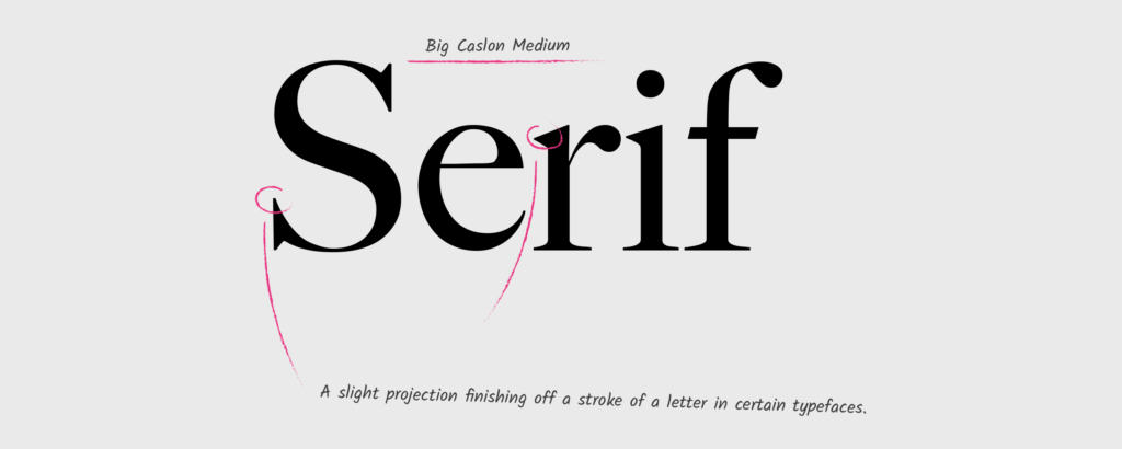
Serifs give the eye a curve to hug.
Some historians claim the word originated in 18th century Dutch “schreef” (marks of the pen), while others believe it to be a back-formation from “sanserif.” Serifs were not acknowledged much by designers until they began to be removed and sans serif (from French, sans meaning “without”) typefaces began their ascendancy in the late 19th century. I sometimes wonder if “serif” might be etymologically linked to the Urdu word “sharif,” which means “cultured and refined.”
Physically, serifs originated in the flourishes of the calligrapher’s wrist. In calligraphy, the art of hand-drawn lettering, serifs serve two purposes. They help a writer gain control over mark-making momentum, the arm shifting pressure and angles to form curves and modify the thickness of strokes. Serifs are to a calligrapher what a run-up and follow-through are to a fast bowler in cricket.
Over time, through practice and perfection, what was once mechanical necessity evolved into expressive ornamentation that made writing appear individualistic and intricate. Serifs give the eye a curve to hug. When carved into stone, serifs allow words to appear aligned. Hence, the Victorians used serifs in all of their typefaces, and they were common in Italian Renaissance architecture. They were seen as “Roman.” Today, the names of computerized fonts (Times New Roman, Comic Sans, etc.) and the shape of the letters themselves encapsulates the history of human civilization.
In the times of Gutenberg (1450 and thereabouts), paradoxical as it may sound, printed text was made to look handwritten. Printing was seen as something sinister — a frightening and impersonal new technology. With the industrial revolution, large numbers of people were displaced, and the countryside was torn up and polluted. Intellectuals were skeptical about the era’s new machinery. William Blake famously asked,“And was Jerusalem builded here. Among these dark Satanic mills?”
It didn’t help that printers were small groups of Masonic men who worked late into the night, developing carefully guarded trade secrets with ink and metal in foul-smelling foundries. Typesetting employed mirroring: the letters were done backward and looked nonsensical, but when applied to paper, the result, almost like a form of magic, was perfectly legible text. At this point, all typefaces in commercial use were adorned with serifs.
The first set of sans serif mechanical typefaces was inspired by the discovery and translation of the Rosetta Stone (one of the earliest surviving uses of sans serif type). When Napoleon invaded Egypt at the turn of the 19th century, he brought along a cohort of academics and cultural experts (to invoke Alexander the Great’s court of historians and poets). Together, they looted and collected many historical artifacts, including the Rosetta Stone. The venture’s badly planned logistics, however — and the maritime dominance of the Britain navy — enabled the English to hold hostage of the French and eventually take possession of the Stone. Newspapers reported the event — and the Stone’s discovery — which led to widespread public excitement and speculation about mummies, sarcophaguses, hieroglyphic murals, and of course, curses.
Following this, the first sans serif fonts tapped into a growing cultural mania for all things Egyptian. They were seen as echoes of the Ancients. However, these fonts offended the elites. To them, letters without serifs appeared nude and uncivilized. The typefaces were called “grotesque” and came to be known as Gothic. (This should not be confused with Blackletter typefaces, the original thick black, highly ornate letters that were considered Gothic until sans serifs came along—definitions of “Gothic” have clearly changed over time.)
These initial sans serifs emerged during the age of Romanticism, a cultural moment that eschewed the Church and industrialization. The Romantics valued the humanities and the arts. Curiously, sans serifs appealed to two different poles of society at the time: bohemians and industrialists. Because these typefaces were shorn of all medieval pretensions but were also similar to writing systems developed by architects, industrialists, and ship-builders in mechanical plans and drawings, they were far more versatile than serifs.
But serifs don’t die easily. By 1896, they staged a comeback with the Art Nouveau movement, which celebrated “floriated madness.” The movement so infuriated the typographer Adolf Loos that, in 1908, he wrote an essay titled “Ornament and Crime” declaring that the “evolution of culture marches with the elimination of ornament from useful objects.” For Loos, as Heller and Anderson note in their book on New Ornamental Type, superfluous decoration was not merely a waste of designer’s time—it was downright immoral.
Despite the warnings of fire and brimstone, serifs made yet another comeback decades later—this time in pre-depression America, through the Arts and Crafts movement. William Morris, a British textile designer, had a novel antidote to the austerity of industrialization: He combined modern printing methods with traditional art. Serifs played a key role in the feeling of traditionalism he sought to invoke.
Yet the damage was done. The Bauhaus movement, while retaining some decorative elements as a way to escape definition and stereotyping, rejected ornamentation as a relic of an older order. Modernism was born, and it hinged on the belief that minimalism enables the cleanest communication. Slowly, the memory of the connection between the calligrapher’s wrist and the typographer’s lead began to fade.
The “grotesque” sans serif of the Victorians has come to represent the approachable mainstream.
Postwar movements sought, like the Romantics before them, to emphasize the foolishness of the elites. One particular line of attack was on the serif. What had once seemed ornate and the very definition of “civilized,” harking back to the grand Roman Empire, was now viewed as chintzy and messy. Designers sought to distance themselves from the aggression and destruction of European imperialism, which was embodied in the serif.
The “neatening” of type was a way to clean up the mistakes of history. However, this movement was at first restricted to posters and public signage. Technologically, the pen had been replaced by the typewriter. Leaning on fonts like Courier, most typewritten material in the early-mid 20th century possessed pronounced serifs.
Then, within a few decades, came the computer — and a man named Steve Jobs.
As a student, Jobs famously noticed that posters on his college campus were beautifully lettered. Asking around, he discovered that the signage originated in the high-quality calligraphy classes offered on campus. He decided to study calligraphy, which eventually resulted in “fonts” for Apple’s word processing software. The initial six fonts that came with the Apple II have now given way to millions, with “foundries”—illustration and design studios—that employ illustrators and graphic designers to focus solely on producing electronic typefaces for various media.
Beginning with Jobs, computers enabled a dizzying level of typographic innovation. Word processors continue to blur the line between design and illustration.
The aesthetic choices that require Google’s brand image to appear clean and friendly are quite obvious. This is a corporation asking you to trust it with your most intimate data—search history, location, email, chats, etc.—so it can help advertisers reach you more efficiently. It’s curious, then, that the “grotesque” sans serif of the Victorians has come to represent the approachable mainstream. What was once considered proper — traditional serif-based typefaces — is most often seen in counterculture: in tattoos, graffiti, and hipster zines.
Whether one belongs to the serif camp or the sans serif camp, one thing can be agreed upon: The history of type reveals the history of ourselves.
written by Neel Dozome
Drawing comics and writing essays on graphic culture. Life goals include a cyberpunk novel, an intellectual history of Bruce Lee, and a hand stand.